As a result of the utter failure of my recent long form copy landing experiment I decided to take some of the lessons I learned and apply them to my short form copy landing pages. There were several key points I tried to keep in mind when constructing the new short form landing page. Here’s what I tried to keep in mind:
- Centre and bold the title and sub-title.
- Target the title specifically at the Adwords keyword to increase page quality score.
- Focus the sub-header clearly on the key benefit of the product.
- Use a catchy (and REAL) user testimonial as the first real content.
- Include a source for the testimonial, including a real name, a real company and a live link to the company. Adds greatly to the credibility.
- Provide a clear call to action AFTER establishing credibility.
- Provide clear pricing information.
- As I’m selling software give technical requirements to help re-assure and also stop invalid conversions (ie people using non-compatible computer systems).
Here’s the old short form page.
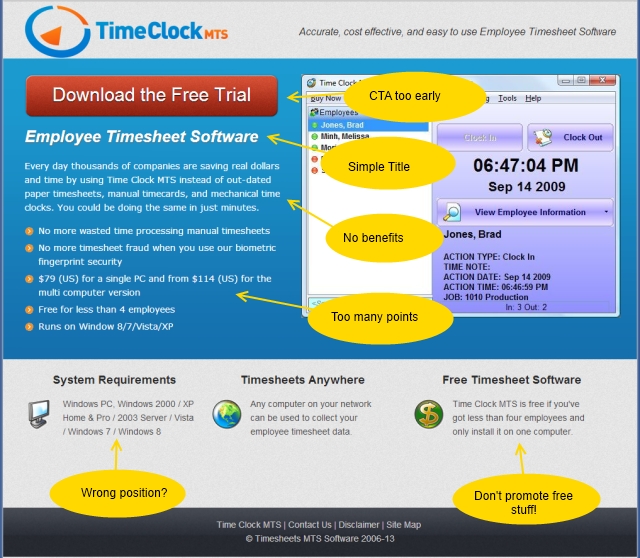
Figure 1 : Old Short Form Landing Page
Not a great landing page but one that has converted fairly well for a while. I believed it could be improved in a number of ways. Firstly, the CTA comes too early. Secondly, the bullet list is too long, the items are too long, and they are not focussed. Thirdly, there’s a very poor benefit focus to the copy. And finally, I believe the system requirements box is better to be used for more important information (such as price).
Here’s the new short form page.
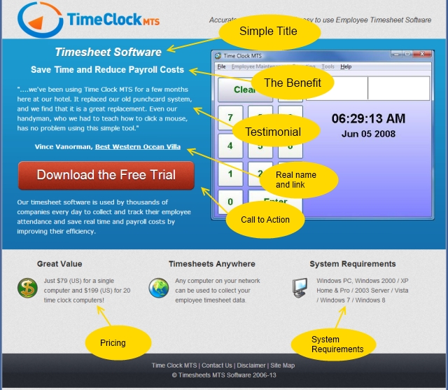
Figure 2 : New Short Form Landing Page
You can see that I’ve done my best to incorporate all of the improvements I discussed in the list above. The centered and bolded title and sub-title to draw the eye and the testimonial is good one. I am particularly happy with the sub-title as it encapsulates what I believe are the two biggest benefits users get from using Time Clock MTS. My only concern is that the testimonial is a little long. I’ve got many other testimonials to choose from so I’ll trial some others in the future. The CTA (the download trial button) is in what I think is a good position, credibility has been established and (hopefully) interest piqued. Key objections that a potential user might have are addressed in the smaller text boxes in the page footer. Namely price objections, using the software on multiple computers, and the system requirements.
I setup a Google Experiment to test the new layout versus the old one. Traffic to these pages is 100% sourced from my Adwords campaigns and I chose to split the traffic 50/50 between the two pages (no guts no glory!).
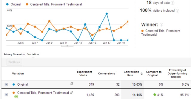
Figure 3 : Experiment Results
After Google had collected 18 days worth of data it closed the experiment having found a clear winner. My new short form landing page performed 41% better than the old page. Clearly a big improvement. I’m delighted that the lessons I’ve learned seem to have paid off here. I’m going to validate the experiment by reconfiguring one of my other Adwords landing pages using a similar approach.
My thoughts about further improvement include trying a shorter (and perhaps punchier) testimonial, trialing a different benefit focused sub header, and (perhaps) changing the colour of the CTA button. I’m a little skeptical of the various “I changed the colour my button and doubled conversions” claims that you read but I mustn’t leave any stone unturned.